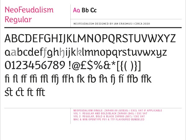
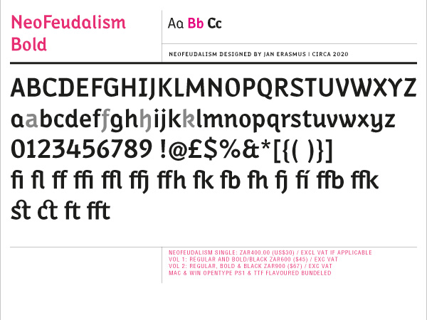
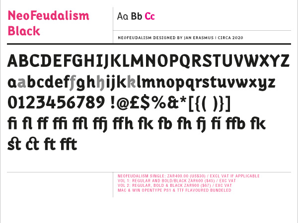
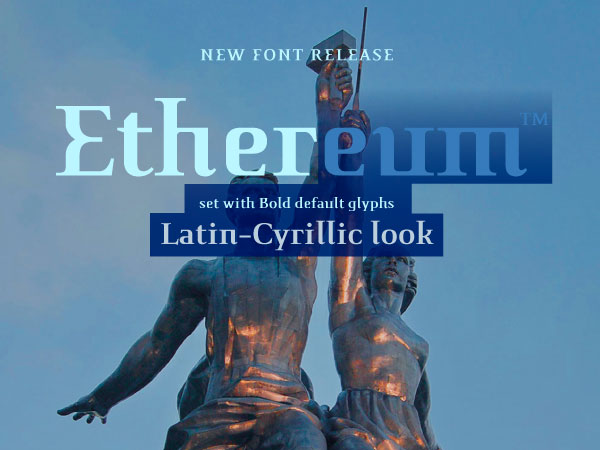
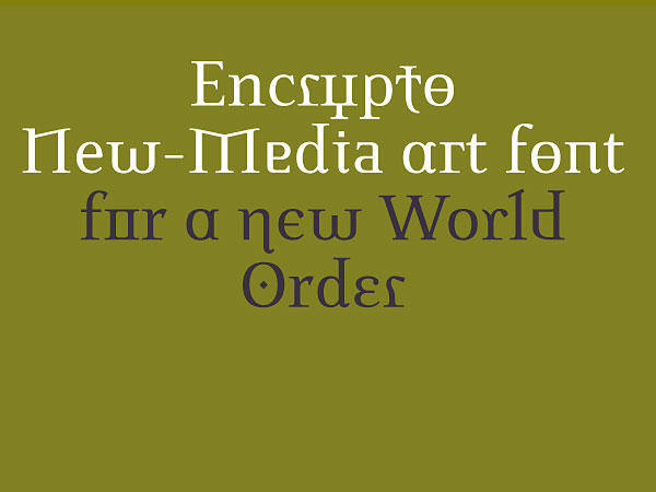
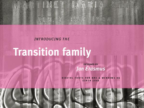
A New Narrow Humanist Sans font that looks as if it was blown backwards into the future.
I decided to design a font which depicts the period towards which we are heading. A narrow humanist sans serif font developed through a synthesis with black letter and a Benton narrow style sans.
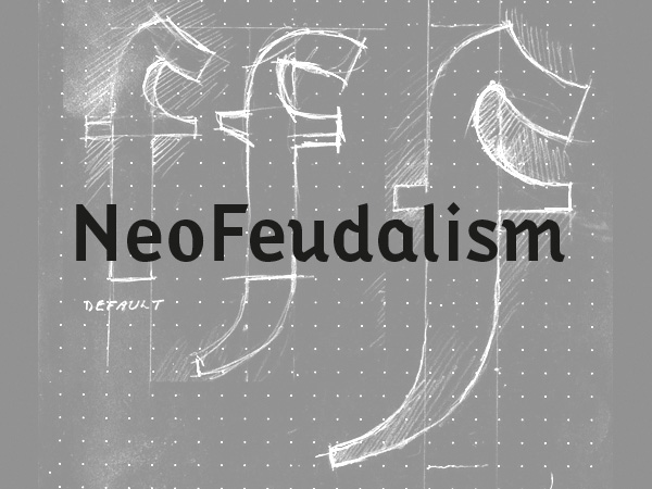
You can clearly see the black letter DNA in the silhouette of this font used for this booklet. You might ask yourself, why these two fonts?. Black letter and a narrow sans serif, an unlikely pairing, which is exactly why these two fonts are ironically perfect. Together in their differences, they create contrast and form, some sort of opposites and dialogue in the font. Together they brandish deconstruction and thus expose and highlight the meaning behind the fontthe chaos of todays world.
Black letter as used in The Guttenberg Bible, will always remind me of
feudalism during the Dark Ages and sans serif will go down as the most important font style used to promoted excessive consumerism in the past few decades. Just as the Dark Ages came to an end,
I have no doubt that consumerism has too.
Iaan Bekker, a typography specialist, remarks that it is interesting that both font styles are German of origin. This coincidence is interesting but not part of my criteria for a selection. It is, however, a remarkable concurrence of circumstances with apparent causal connectionperhaps more unintended parallelism than coincidence. My ultimate font choice was based on the leading fonts of the two periods in time but through discussion and reflection have melded into perfectly opposing synchronicity.
Available from cybergraphics.bz, fonts.com, linotype.com and fonshop.com
Read more/download PDF
Try before you buy
Licence
Purchase font

