Sade
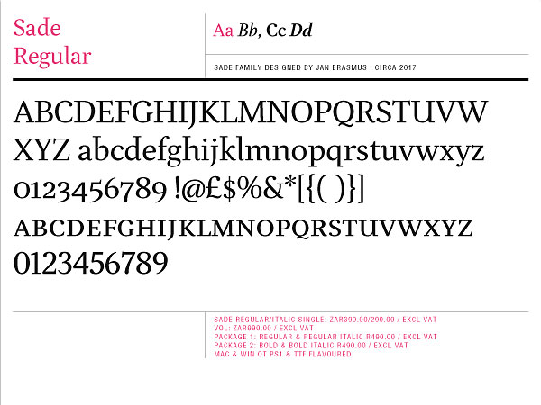
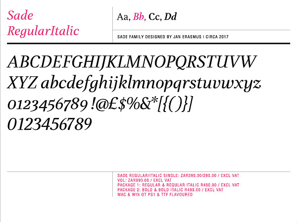
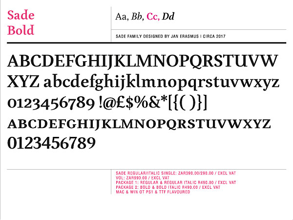
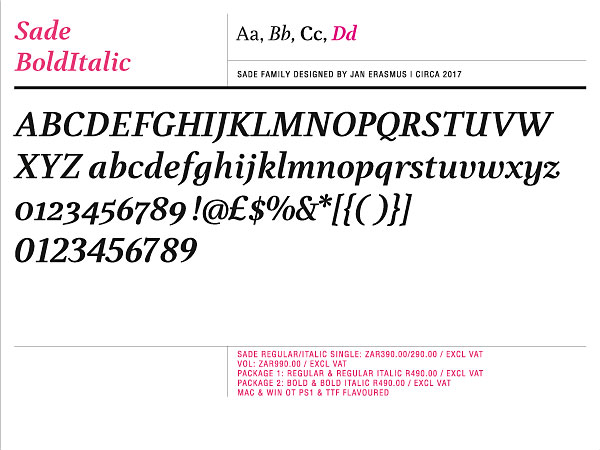
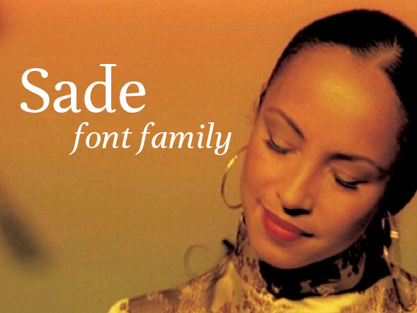
The idea behind designing the Sade family was to design a feminine roman font that is more flowing and less angular like most roman text fonts are.
The font structure is loosely based on Garamond. Sade™ combines a significantly large x-height with relatively compressed letterforms. What is it that makes it beautiful? Voluptuously curved bowls, exquisitely proportioned stokes, finely shaped serifs, graceful ascenders – these characteristics seduce the eye, making us read on. The feminine aspect for example comes into play when the roman face takes on some italic features like the curved serif at the stroke end of the ‘l’ and ‘i’. Another unusual aspect is that I used many different stoke endings which is unorthodox..
Sade was developed mainly for magazine and book text. It is a typeface for continuous text setting, designed to withstand the worst printing conditions: low quality papers, high printing speed with web presses and variations in the ink level of the printing press.
Available from cybergraphics.bz, fonts.com, linotype.com and fonshop.com
Read more/download PDF
Try before you buy
Licence
Purchase fonts
-

Font design
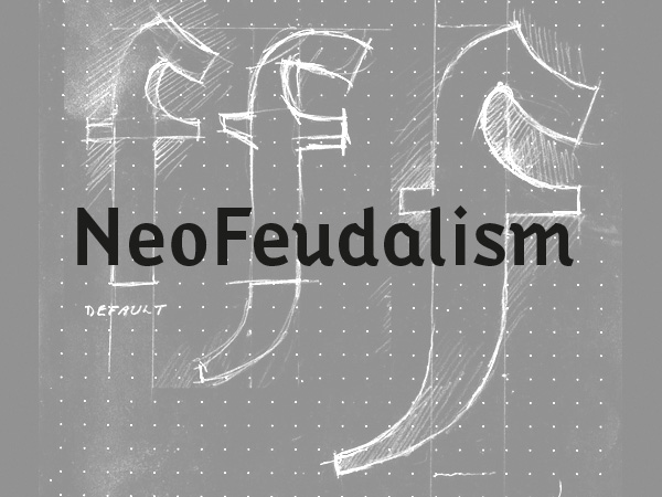
The idea behind this font was to create a synthesised font with Black Letter and a narrow sans serif font.
details
preview
-

Font desing
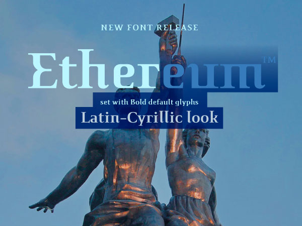
The intention behind creating Ethereum font family was to design a Latin font that gives you a Latin-Cyrillic look.
details
preview
-

Font desing
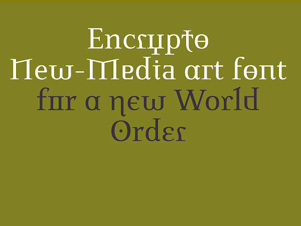
A Latin alphabet that combines alternate alphabet glyphs from 4 major alphabets in a apparently random juxtapositions of alternate glyphs as the user types the words.
details
preview
-

Font desing
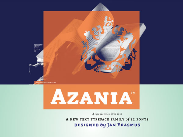
A slab serif text and display typeface family of 12 fonts
details
preview
-

Sade
Font desing
A pretty roman text typeface family of 4 font including small caps and 4 sets on numbers
preview
-

Font desing
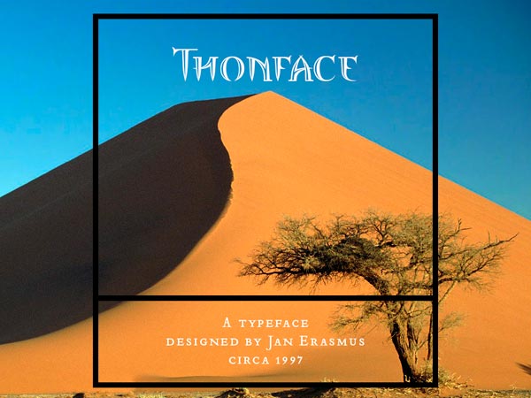
An iconic font family of 3 fonts called Thornface
details
preview
-

Font desing
Lalibela, a synthesis of Bodoni and Ge'ez from Ethiopia. A 3 font family
details
preview
-

Font desing
Due to the current importance of pixel fonts, I decided to have a new look it and take it to the next level.
details
preview
-

Font desing
Allied Technologies's first brand mark. The brief asked for a T and A to be combined
details
preview
-

Font desing
When i designed ExportUncase, the idea was to use a unicase system for all the letters in the font.
details
preview
-

Font desing
I decided to extend history by means of mixing styles which historically have not co-existed.
details
preview

Font desing
Read the definition of proprietary by clicking on the enlargement icon.
details
preview

