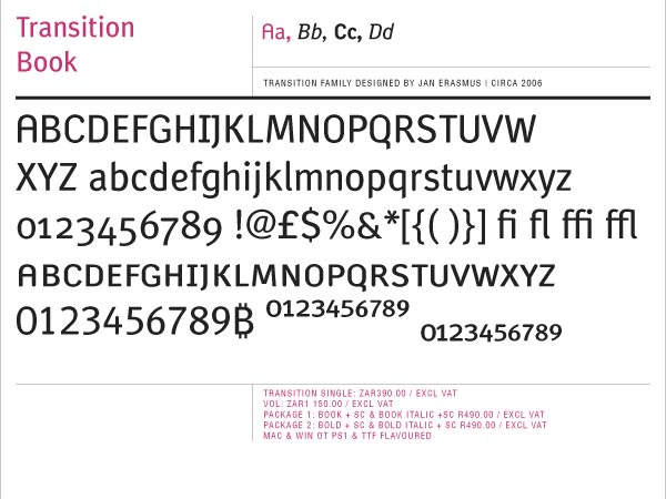
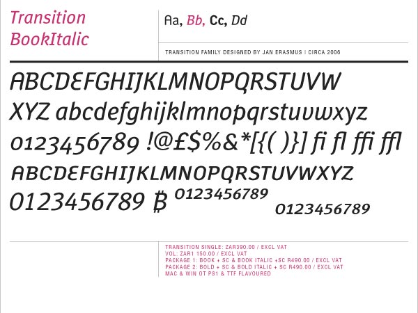
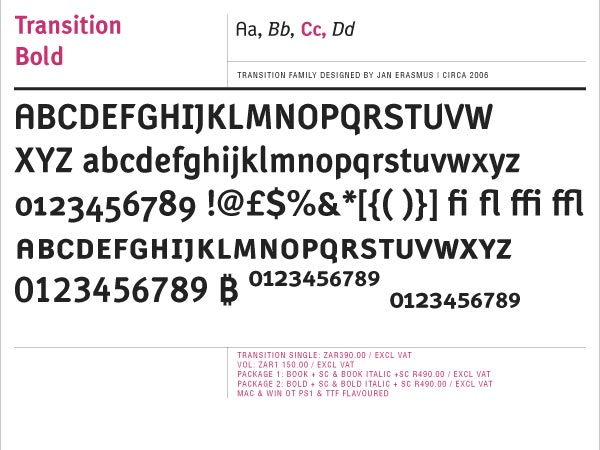
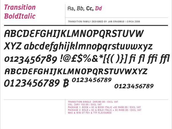
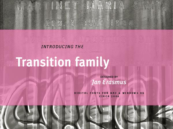
12 Transition font files were refined & upgraded to 4 files with 9 advanced OT features to access all the glyphs.
During October 2003, while I was on sabbatical from my graphic design studio, and teaching at the Department of Film and New Media, University of Cape Town, I started designing Transition. My idea was to create a typeface for film, screen and print use.
I also intended to explore the transition from “Neo-grotesque” Sans to the “Humanist Sans”. I neither wanted to use an extreme mono-spaced, pixel-based font nor a Gray Cell Technology typeface (which draws the anti-aliasing as gray cells next to black ones when depicting the font). One of the first things I took into consideration was computer screen space which was at a premium and so very precious. Traditional book fonts are too wide and so use more screen space than viable.
Available from cybergraphics.bz, fonts.com, linotype.com and fonshop.com
Read more/download PDF
Try before you buy
Licence
Purchase fonts
-

Font design
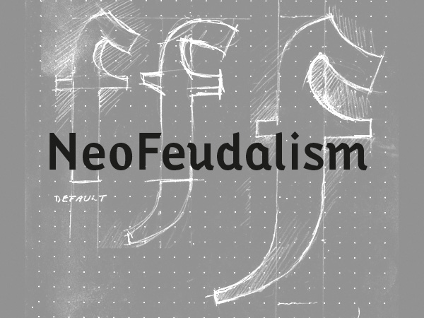
The idea behind this font was to create a synthesised font with Black Letter and a narrow sans serif font.
details
preview
-

Font desing
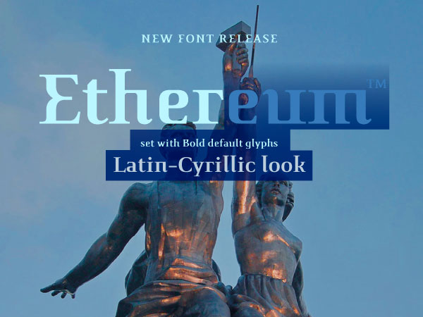
The intention behind creating Ethereum font family was to design a Latin font that gives you a Latin-Cyrillic look.
details
preview
-

Font desing
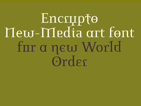
A Latin alphabet that combines alternate alphabet glyphs from 4 major alphabets in a apparently random juxtapositions of alternate glyphs as the user types the words.
details
preview
-

Font desing
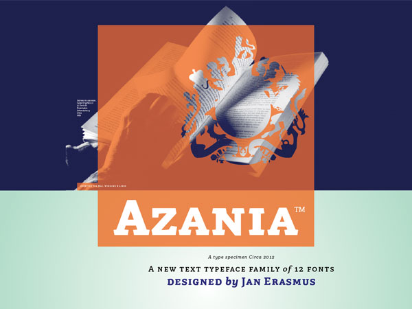
A slab serif text and display typeface family of 12 fonts
details
preview
-

Font desing
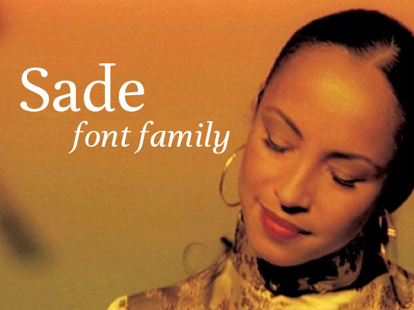
A pretty roman text typeface family of 4 font including small caps and 4 sets on numbers
details
preview
-

Font desing
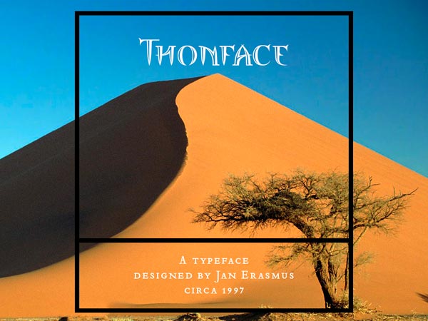
An iconic font family of 3 fonts called Thornface
details
preview
-

Font desing
Lalibela, a synthesis of Bodoni and Ge'ez from Ethiopia. A 3 font family
details
preview
-

Font desing
Due to the current importance of pixel fonts, I decided to have a new look it and take it to the next level.
details
preview
-

Transition
Font desing
Allied Technologies's first brand mark. The brief asked for a T and A to be combined
preview
-

Font desing
When i designed ExportUncase, the idea was to use a unicase system for all the letters in the font.
details
preview
-

Font desing
I decided to extend history by means of mixing styles which historically have not co-existed.
details
preview
-

Font desing
Read the definition of proprietary by clicking on the enlargement icon.
details
preview

